
Probability histograms are useful visual representations for understanding the probability distribution of a data set. They are essential in statistics and data analysis as they shed light on the probabilities of events. In this piece, we’ll dive into what a probability histogram is, the different kinds it can take, and some real-world applications.
What is a Probability Histogram?
Probability Histogram Definition
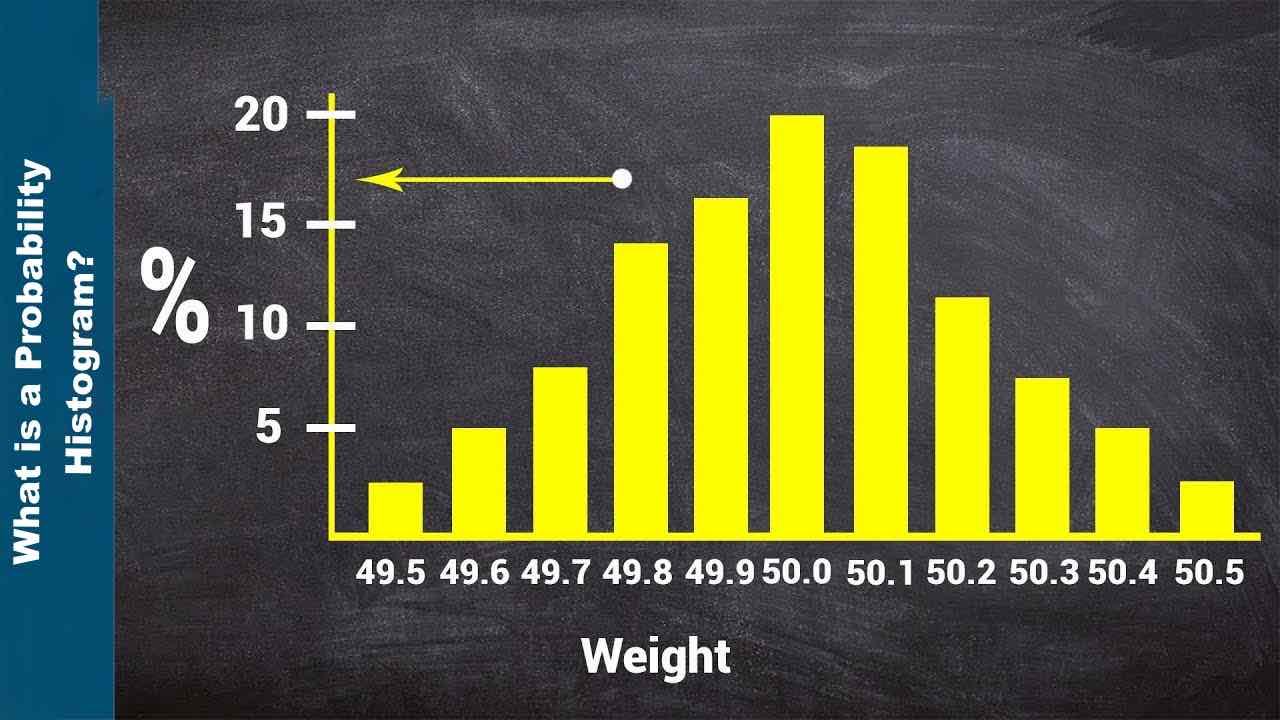
A probability histogram shows how a probability distribution is represented. It is made up of a series of bars. Each bar represents a range of values, and the height of the bar shows how likely or how often values in that range occur. Probability histograms are especially helpful when working with continuous data because they allow you to group values into intervals and look at how likely they are to be.
How to Construct a Probability Histogram
A probability histogram is constructed through steps that organize and visualize data. To construct a probability histogram, follow these steps:
Organize the Data
Begin by organizing the dataset that will be analyzed. Make sure that the data is numerical and suitable for creating a histogram.
Determine the Number of Intervals
Determine the number of intervals, also known as bins or classes, that will be used to group your data. The intervals used are determined by the size of the dataset and the level of detail desired in the histogram. The square root rule, Sturges’ formula, and Scott’s normal reference rule are all methods for determining the number of intervals.
Calculate the Interval Width
To find the width of each interval, divide the range of your data by the number of intervals. The range is the difference between your dataset’s top and bottom values.
Create Intervals:
Set the lower and upper limits for each interval. Ensure that the intervals don’t overlap and cover the whole data range.
Count the Frequencies
Keep track of how many data points fall into each interval. Iterate through the dataset and increase the count for the corresponding interval whenever a data point falls within its boundaries.
Calculate the Probabilities
Divide the number of times each interval occurred by the total number of data points to find the chance that the interval will happen again. This step turns the frequencies into probabilities by making them all the same.
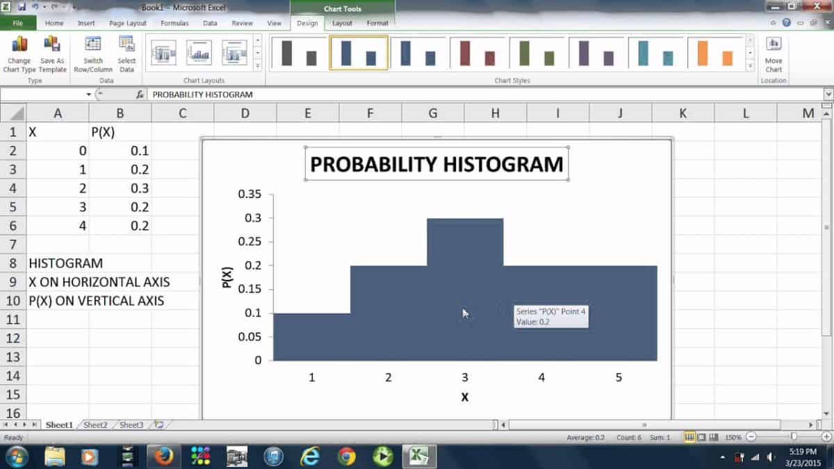
Construct the Histogram
Draw a horizontal axis for intervals and a vertical axis for probabilities. For each interval, draw a rectangle (bar) whose width corresponds to the interval width and height corresponds to the occurrence probability. Depending on the desired depiction, the height of each bar can be proportional to the probability or relative frequency.
Label the Axes
Label the intervals on the horizontal axis and the probabilities or relative frequencies on the vertical axis. Provide a descriptive title for the histogram that specifies the dataset and probability distribution being represented.
Add Additional Information
You can improve the histogram by adding more statistics, such as the mean, median, standard deviation, or other relevant numbers. These details give us more information about how the distribution works.
Interpret the Histogram
Examine the histogram constructed to figure out how the dataset’s probability distribution looks. Look at the histogram’s shape, symmetry, peaks, and other patterns to learn more about the data.
Types of Probability Histograms
A few different kinds of probability histograms are often used in statistical analysis. Let’s look at the ones that we are familiar with:
1. Uniform Probability Histogram
A uniform probability histogram is created when all values in a data set have the same chance of occurring. In this case, all of the bars in the histogram will be the same height, which shows that the data is distributed evenly.
2. Normal Probability Histogram
The shape of a normal probability histogram called a bell curve or a Gaussian distribution, is symmetrical. It shows a set of numbers where most of the numbers are close to the mean and only a few are at the extremes. The height of the bars goes up gradually until the mean, where it peaks, and then goes down in the same way on both sides.
3. Skewed Probability Histogram
A skewed probability histogram occurs when the data are not distributed similarly on both sides. It can be skewed to the right (positively skewed) or to the left (negatively skewed). In a positively skewed histogram, the tail goes up, while in a negatively skewed histogram, the tail goes down.
4. Bimodal Probability Histogram
A bimodal probability histogram shows a data set with two different peaks or modes. It shows that the data has two different groups or subpopulations, each with its own set of characteristic values.
Probability Histogram in Real-Life Applications
Probability histograms are used in many different fields for different reasons. Let’s look at some of the most common ways probability histograms are utilized.
Statistical Analysis
Probability histograms are often used in statistical analysis to determine how a dataset is distributed and its odds. They show the data in a way that makes it easy for analysts to spot patterns, outliers, and other important parts of the dataset.
Data Modeling
In data modeling, probability histograms are a very important tool. They help find the best probability distribution that fits a set of data. Data Analysts can choose the best model for their data by comparing the histogram to different theoretical distributions, such as the normal, uniform, and exponential distributions.
Risk Assessment
Risk is measured and managed with the help of probability histograms. They help us determine how likely different outcomes or events are to happen and how likely they are to happen. Data Analysts/Researchers can determine certain outcomes’ likelihood by making a probability histogram for a specific risk factor, like stock returns or weather patterns. This helps them make smart decisions.
Quality Control
Probability histograms are also used to track and control the quality of products during the manufacturing and quality control processes. Manufacturers can see if the products meet the desired standards and find any differences or flaws by making histograms of product characteristics like length, weight, or size.
Finance and Investment
In finance and investment analysis, probability histograms are used a lot. It helps Financial Analysts understand how asset returns, stock prices, and market volatility will likely be distributed. By looking at these histograms, financial analysts can make smart decisions, determine how much risk there is, and estimate how much money they could make.
Market Research
Probability histograms are used in market research to determine how customers behave, what they like, or what they think. By making histograms from survey responses or other collected data, researchers can find patterns, trends, or groups of customers. This lets them make marketing decisions based on the data.
Environmental Analysis
Probability histograms are useful for analyzing environmental data, such as rainfall patterns, air quality, or how temperatures vary over time. Scientists and researchers can study the probability distribution of environmental variables, find trends, and make predictions or assessments about climate change, pollution levels, and natural disasters by making histograms.
Healthcare and Medical Research
Probability histograms are used in medical research and health care. They are used to look at patient data like blood pressure, cholesterol levels, or the number of people with a certain disease. By making histograms, researchers can find risk factors, determine how health indicators are distributed, and make decisions about diagnosis, treatment, or public health interventions based on facts.
Process Improvement
Process improvement methods like Six Sigma and Lean Six Sigma use probability histograms. They help find differences and bottlenecks in processes and help make decisions for optimizing processes and improving quality.
Education and Learning
Probability histograms are used in universities to teach students statistics and to help them analyze data. Students can make their own histograms to understand and see the distribution and probabilities of a dataset. This helps them understand statistics better.
The Importance of Probability Histogram
In statistical analysis and data interpretation, probability histograms are important. Let’s see why probability histograms are so important.
Visual Representation
Probability histograms provide a visual representation of data, making it easy for analysts to understand the distribution and odds of a data set. When data is shown in bars or bins, it’s easy to see its patterns and characteristics. This makes it easier to spot outliers, clusters, or trends.
Distribution Analysis
Probability histograms allow you to look at how data is distributed. Analysts can examine the data’s shape, symmetry, skewness, or multimodality by constructing a histogram. This information is important for determining the dataset, choosing the best statistical models, and making accurate conclusions and predictions.
Probability Assessment
Probability histograms help in the evaluation of probabilities and likelihoods. Analysts can quantify the chances of specific events or outcomes by calculating the relative frequencies or probabilities associated with each bin or interval. This data is useful for risk assessment, decision-making, and understanding uncertainties in various fields.
Comparison and Contrast
Probability histograms make it easier to compare and contrast different datasets or distributions. Analysts can compare different datasets’ characteristics, central tendencies, or variabilities by superimposing multiple histograms or placing them side by side. This comparative analysis aids in the development of insights, the identification of differences, and the making of informed comparisons.
Identifying Outliers and Anomalies
Probability histograms help find outliers and anomalies in a set of data. Outliers are extreme values that differ greatly from the rest of the data. In a histogram, they often look like bars that stand out from the rest. Finding outliers is important because they could be signs of measurement errors, mistakes in data entry, or rare events that need to be looked into further.
Decision-Making and Inference
Probability histograms can be used to make decisions and draw conclusions based on data. Analysts/Researchers can evaluate risks, predict what will happen in the future, and make smart decisions when they know how likely each outcome is. Probability histograms help with statistical inference, testing hypotheses, and drawing conclusions from data.
Communication and Explanation
Probability histograms are a great way to share statistical information with a wide range of participants. They take complicated statistical ideas and make them easier to understand. Analysts/Researchers can explain data distributions, probabilities, and trends in a way that is easy to see and understand using probability histograms.
Model Selection and Validation
Probability histograms are useful for model selection and validation. Analysts/Researchers can determine the optimal probability distribution to represent the dataset by comparing the shape of the histogram to theoretical distributions. This facilitates the selection of statistical models, the validation of hypotheses, and the verification of the accuracy of analyses and predictions.
Quality Control and Process Improvement
Probability histograms are crucial to control quality and improve processes. By making histograms of process parameters or product characteristics, companies can track changes, find performance gaps, and take steps to fix them. Histograms of probabilities are an important part of the statistical process control (SPC) and Six Sigma methods.
Educational Tool
Probability histograms are widely used in the teaching and study of statistics. They illustrate probability, distribution, central tendencies, and variability. By creating histograms, students can gain practical experience in data analysis, develop statistical reasoning skills, and effectively interpret results.
Source: Cynthia Counter (YouTube)
Probability Histogram Examples
Let’s look at a few examples to understand the concept of probability histograms better:
Probability Histograms Example 1: Daily Temperature
Think about a set of data that shows the daily temperatures recorded in a certain city over the course of a year. We can make a probability histogram with temperature ranges on the horizontal axis and probabilities on the vertical axis to determine how temperatures will likely be distributed. If the temperature data has a skewed distribution, the histogram will have a tail that points up or down, depending on how skewed the data is.
Probability Histograms Example 2: Coin Toss
Let’s assume we want to investigate the probability distribution of getting heads in coin tosses. We can generate a probability histogram by recording the number of heads obtained in multiple trials. The horizontal axis represents the number of heads, while the vertical axis represents the likelihood of getting that number of heads. Because the coin is fair in this case, the histogram will have a uniform distribution, with each bar having the same height.
Probability Histograms Example 3: Exam Scores
Imagine having a group of students’ test scores in a dataset. A probability histogram can determine how the scores will likely be distributed. We divide the scores into ranges, such as 0–10, 10–20, etc., and count how many scores fall into each range. The height of each bar in the histogram shows how often or how likely it is to get a score in that range. The histogram will look like a bell if the scores are distributed normally.
The Bottom Line
Probability histograms are an effective way to see and understand how the probabilities in a dataset are distributed. Making graphs out of data, they help us understand how likely it is that different things will happen. Whether the distribution is uniform, normal, skewed, or bimodal, a probability histogram can help you understand the data better. Statisticians and data analysts can make good decisions and draw meaningful conclusions from their data if they know how to read the different types of probability histograms and how to interpret them.
If you like this article, see others like it: